BookNook
Since 1973, BookNook has been helping readers, music lovers and videophiles find quality material at their bookstore in Decatur, GA

The Challenge
Local feel and customer service have been essential to BookNook’s business strategy. But with the recent pandemic, BookNook wanted an e-commerce website to keep up with the changing times. For this spec project, my role as UX designer was to bring together BookNook’s local shop charm to life online, by creating an e-commerce website with a frictionless browse and checkout process.
The Discovery
Some of BookNook’s direct competitors are Barnes & Noble, Powells Books, HalfPrice Books, and Eagle Eye Book which is a local bookshop in Decatur.
Feature Inventory Analysis
After visiting each of the competitors' websites I compared some of the similarities and differences amongst specific features on their websites. Based on BookNook’s business strategy which is to prioritize the needs and preferences of the local customer, the following table shows the list of features that are compared between all the direct competitors.

Findings
Powells Books comes the closest in offering as many features as possible that are important to the target audience of BookNook.
Barnes & Noble is very successful as an e-commerce website with a frictionless checkout process. However, they do not have the local feel of a shop which the users prefer.
Comparative Analysis
Some of the retail e-commerce industry leaders are Amazon, Target, and Etsy. To have a deeper understanding of what makes these industry leaders successful I did a platform and traffic source analysis for each of them.

Traffic analysis findings
The majority of users arrive on each of the websites directly or through search engines. So brand recognition is going to be important for BookNook in increasing its presence and traffic online.

Platform analysis findings
The data showed that users browse products and make purchases increasingly on their mobile versus desktop. This data is helpful in emphasizing the importance of creating BookNook’s brand and usability on mobile as efficiently as the desktop.
Define
For this project, the target audience I selected was a ‘Gift Giver’ based on which I created a scenario and User Persona to further understand BookNook’s primary users. They are an avid online shopper. They buy gifts last minute and depend heavily on recommendations
“It’s not how much we give, but how much love we put into giving”

Problem Statement and How Might We’s
Aliyah needs a way to find book recommendations so that they may easily find a gift based on their interest and within their budget.
How might we provide a variety of recommendations for different demographics?
How might we create a checkout process with the least number of steps involved?
How might we expedite the gift pickup after they make the purchase?
-
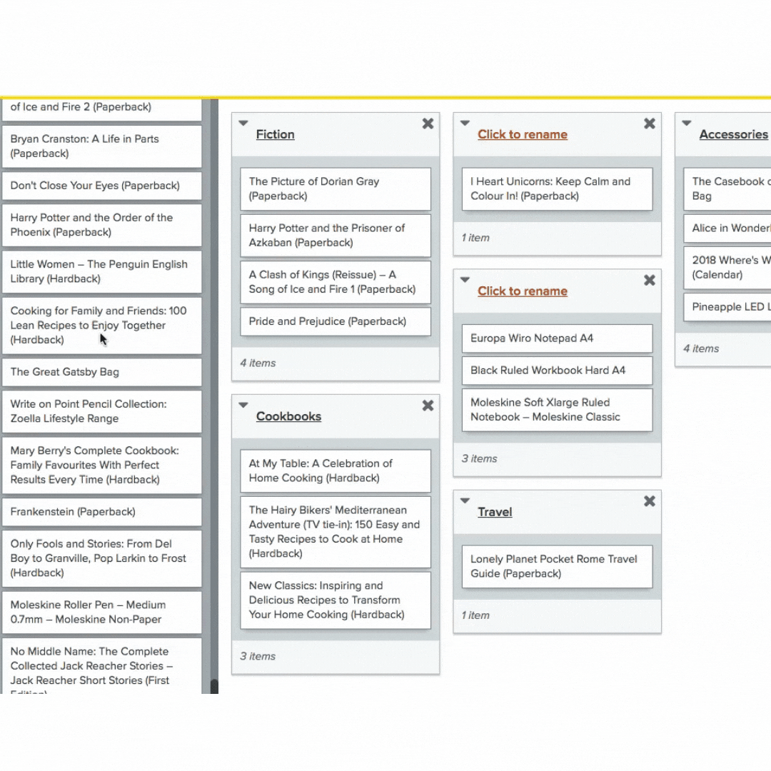
Card Sorting
To generate an effortless navigation system for all the products found on BookNook’s website, I did a card sorting exercise. 16 participants sorted through the product list. This helped generate categories and navigation design, as perceived by the users of the website.
-
Site Map
The card sorting helped create similarities and relationships between products and categories which helped define the architecture of the site.

The Ideation
User Flow
I created two user flows to highlight BookNook prioritizing its users’ needs.
The first task was created for the user to have a frictionless browse and checkout process
The second task was to contact the business with any comments or questions

Sketches
I started sketching some initial design layouts before getting to the mockup stage. This helped me scope out the possibilities of incorporating some key navigation elements such as Sort By features to ensure the target users can buy products based on recommendations.


Wireframes
The next step after sketching out the low fidelity wireframes was to create a prototype with all the data collected from card sorting and the site map for an easy and intuitive navigation. I began with designing for the mobile first, and then for the website. This helped me maintain accessibility and also keep in mind the needs of the users who prioritize browsing for products on their mobile over desktop (from C&C analysis).
Key elements to highlight:
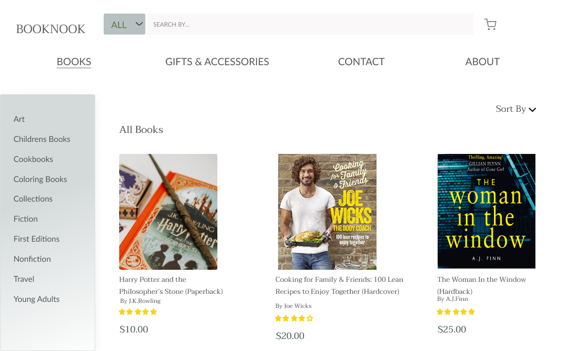
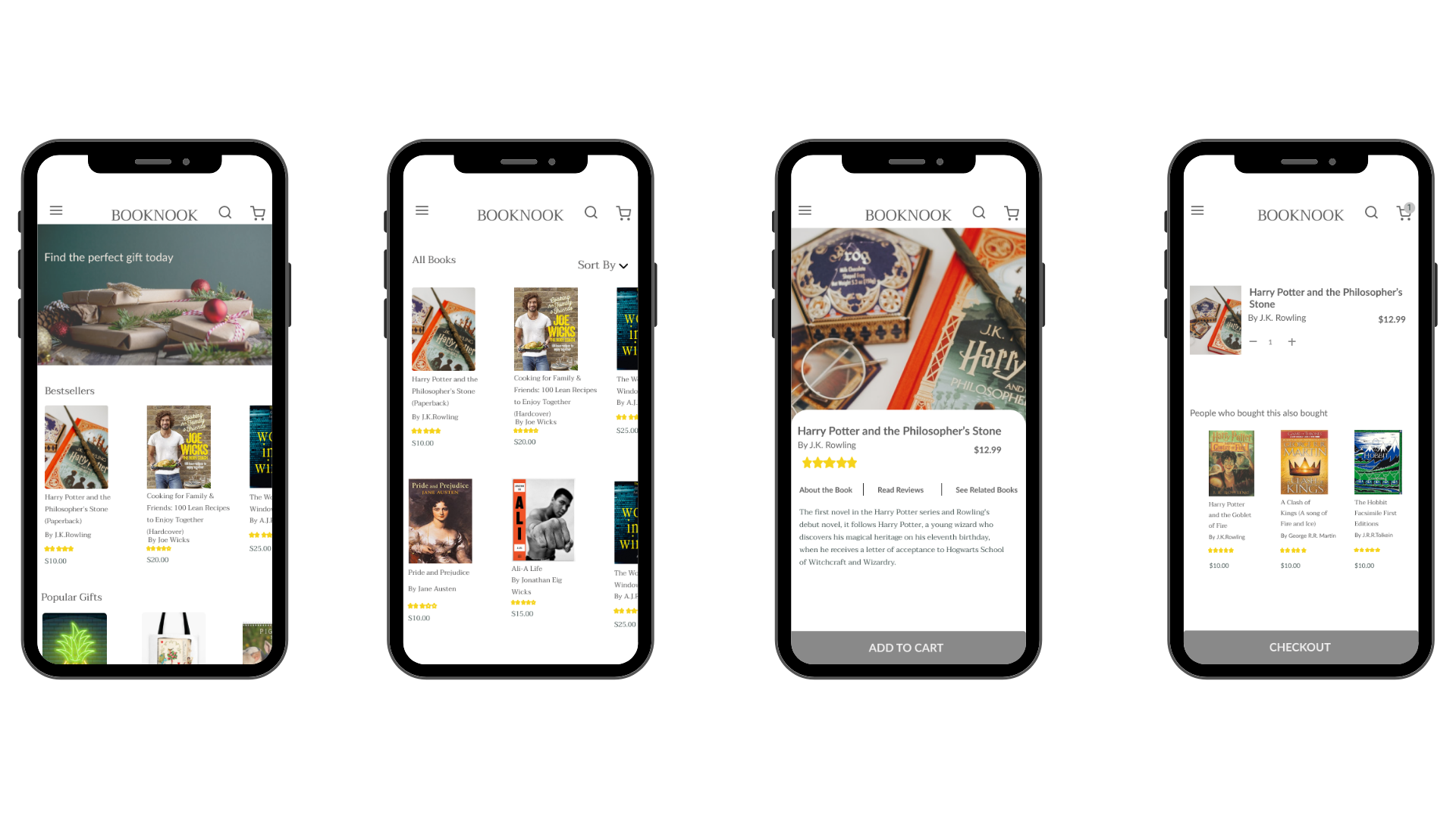
I wanted the homepage to immediately capture the user’s attention, by looking at the hero image of gifts and holidays.
I also wanted to keep it simple for users to navigate directly to the Bestseller option to browse for products and make a purchase.
Under the product description page I wanted the users to have the options to read description, reviews, and see other related products.


Mockup
In the mockup stage, I worked on the design system with finalizing the typography and color palette.
The hero image was intentionally selected to highlight the gift-giving and holiday feel and capture the target user’s attention. It also made it easier for the users to navigate directly to the product listings page by clicking on the image itself and not have to figure out where to go to find the product in mind.
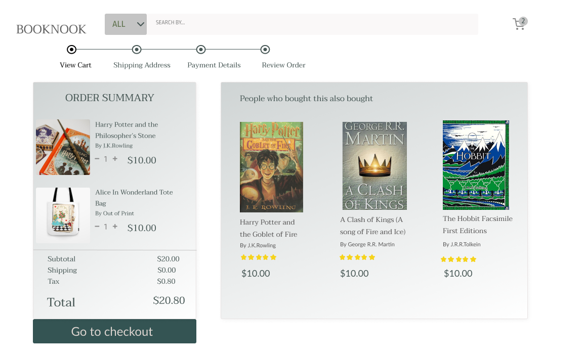
I wanted the customers to be engaged in the website for as long as possible and thus added the People who bought also bought this option when they view the shopping cart
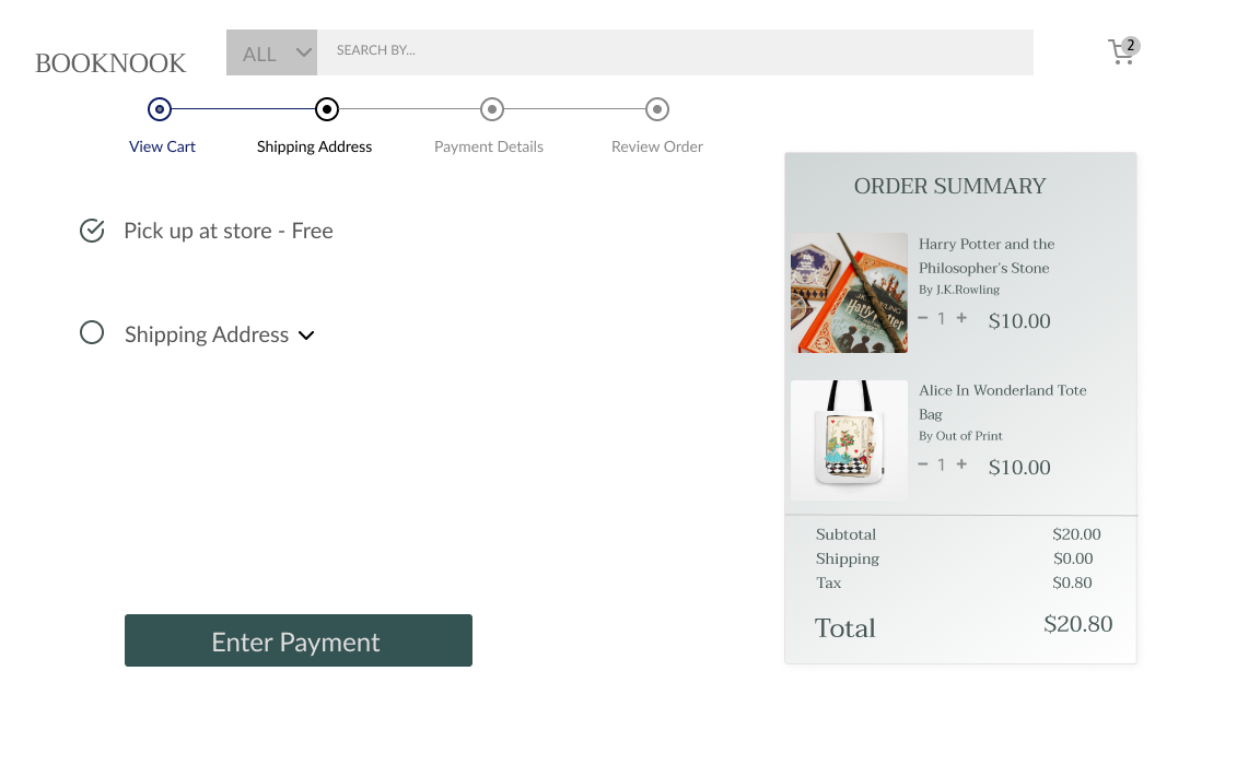
I added the progress bar at the checkout process to set the expectations for the users to know the number of steps required in order to complete the purchase.
For BookNook’s local shopping experience I added an option for the user to pick up their product after purchase, from the store. This would encourage the users to make a trip to the bookstore and experience BookNook’s customer service.


-
Selecting products based on recommendations
Since our target users depend heavily on recommendations I added a Sort By feature to help the user browse products based on various options such as Bestsellers, Prices Low to High, High to Low, and Average Customer Ratings.

-
Read & Write Reviews and See Related Products
On the product description page, I added sections and tabs for the user to be able to read & write reviews as well as browse other related products. This is to further help the user have an effortless engaging experience.


Usability Testing
Goal
Users should be able to select products based on recommendations and checkout items within 2 minutes.
Metrics
Qualitative Data
Capture the data on what the users have to say about completing the two tasks?
Quantitative Data
Amount of time it takes from start to finish purchasing a product
Amount of errors made while selecting, adding, and completing the purchase of item
-
Affinity Map
I had five candidates participate in the usability testing. After which I went on to create an affinity map based on the results from the usability tests

What did the users say?
“The pictures definitely make me want to start my holiday shopping.”
“Having a prominent Contact tab shows that the bookstore prioritizes its customer service and encourages users to contact them.”
“The color contrast was a bit confusing on the progress bar at the checkout steps.”
Quantitive Data
-

Amount of time to complete purchase
On average it took users 2 minutes 12 seconds to complete selecting two products and finishing the checkout process
-

Amount of errors
On average it took users 2 errors to complete selecting two products and finishing the checkout process
What’s next?
Moving forward I’d like to continue working on iterations based on the usability testing results and conduct another round of usability tests to validate the iterations. Some of the iterations that require immediate attention would be as follows:
Make all secondary categories in both BOOKS and GIFTS sections functional.
Make all tertiary categories under Fiction and Nonfiction wireframes functional.
Rearrange all the category listings by similarities, associations, and intuitiveness and not alphabetical order
Fix color and contrast on the progress bar in the checkout process.
Add all the product listings to each wireframe under its right location